Why You Should Care About Color Choices in Nativity Art
Explore the colors in Nativity art. Discover how each hue reveals deeper meanings behind Christ’s birth. Uncover the symbolism today.
Grace Callahan
12/8/20245 min read


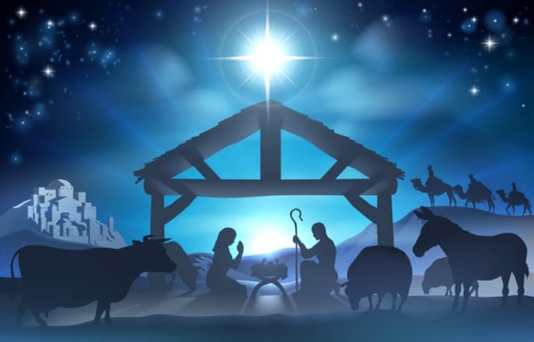
Colors in religious art don’t just fill space—they carry messages, evoke feelings, and point us toward deeper truths. In traditional Nativity art, the colors we see are rich with purpose, from the heavenly blues of Mary’s robe to the earthy browns of the shepherds’ attire. Have you ever wondered why certain hues are used over and over? What do they mean, and how do they deepen our understanding of Christ’s birth? Let’s dive into the sacred language of color in Nativity art and uncover how these choices bring the Christmas story to life.
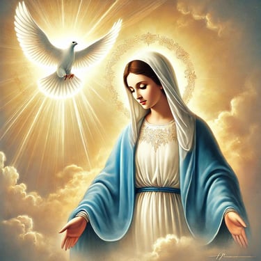
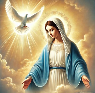
Mary’s Blue: The Queen of Heaven
If you’ve seen Nativity art—whether in an ornate cathedral or on a humble Christmas card—you’ve likely noticed Mary clothed in blue. Why blue? Is it just a flattering color, or is there more to it?
Historically, blue was one of the most expensive pigments available to artists. Ultramarine, a vibrant shade derived from lapis lazuli, was imported from Afghanistan and cost more than gold in medieval times. This made it a rare and precious choice, reserved for the holiest of subjects.
But it’s not just about cost; blue carries profound symbolism. It represents heaven, divine mystery, and Mary’s unique role in salvation history. By clothing Mary in blue, artists tell us she is not just the mother of Jesus—she’s the Queen of Heaven, chosen by God to bring His Son into the world.
Blue also conveys a sense of calm and peace. Imagine gazing at Mary in a Nativity painting. Her serene blue robe might remind you of a clear sky or a still ocean, grounding you in the quiet wonder of the Christmas story. This color invites us into contemplation, drawing us closer to Mary’s purity, grace, and unwavering faith.
Pause and Reflect: When you see Mary’s blue robe, what does it make you feel? Peaceful? Grateful? Can you imagine her journey of faith, clothed in that celestial hue?
The Royal Purples and Golds of the Magi
Now think about the Magi. They’re often shown in luxurious purples and shimmering golds. Why? These colors weren’t chosen randomly—they emphasize the Magi’s royal status and the significance of their visit to the Christ child.
Purple, in particular, has long been associated with kingship and wealth. It was one of the hardest dyes to produce, requiring thousands of sea snails to create even a small amount. In ancient Rome and Byzantium, purple was reserved for emperors and nobility. When we see the Magi wearing purple, it reminds us they were not just wise men—they were rulers or figures of high status, humbling themselves before the King of Kings.
Gold, on the other hand, symbolizes both material wealth and divine light. It’s often used in Nativity art to highlight Christ’s divine nature. Think of the golden halos or gilded gifts presented by the Magi. These gleaming accents remind us of the eternal glory and majesty of Jesus, even as He lay in a manger.
Visualize This: Picture the Magi’s robes—rich, textured purples accented with golden threads. Does it bring to mind the idea of royalty bowing before divinity? That’s exactly the message these colors convey.
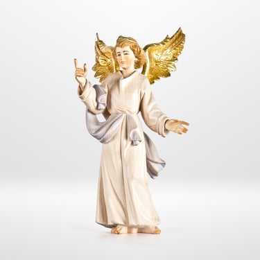
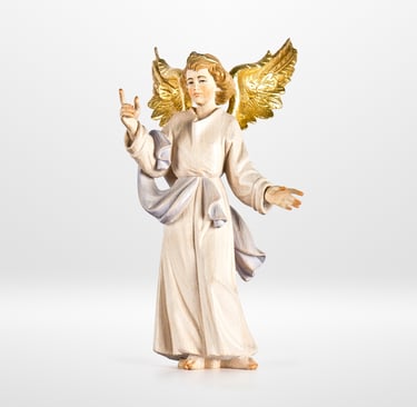
Pure White Angels: Messengers of Heaven
Angels in Nativity art are nearly always dressed in white. Why white? It’s simple but powerful—white symbolizes purity, holiness, and divine truth.
Throughout Scripture, angels appear in white during key moments. At the Resurrection, for instance, an angel is described as having clothing “white as snow.” This radiant color points to their heavenly origin and their role as God’s messengers.
In art, white does more than symbolize purity—it creates contrast. Against the darker tones of the earthly scene, an angel’s glowing white robe draws the viewer’s eye, emphasizing the divine presence breaking into the human world. It’s a visual reminder of the glory of God and His message of peace.
Sensory Prompt: Imagine the brilliance of freshly fallen snow or the soft glow of candlelight through white linen. Can you feel the stillness and awe these moments evoke? That’s the effect of white in Nativity art.
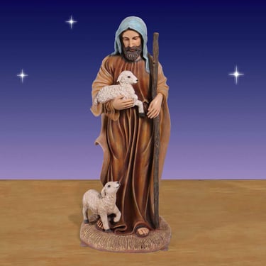
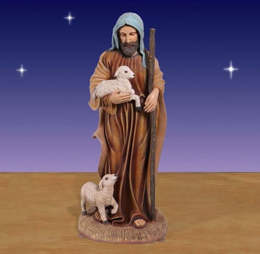
Earth Tones: The Shepherds’ Humble Faith
In contrast to the royal Magi and the celestial angels, the shepherds are painted in earthy tones—browns, greens, and grays. These colors reflect their humble lives, their connection to nature, and their simplicity.
The shepherds weren’t wealthy or influential. Yet they were among the first to hear the angels’ message and witness the newborn Christ. Their earth-toned garments remind us that God’s love is for everyone, no matter how lowly or overlooked they may feel.
In many paintings, the shepherds’ muted tones create a stark contrast with the brighter colors of Mary, the Magi, or the angels. This contrast draws attention to their humility and highlights the radical inclusivity of Christ’s birth.
Inclusive Thought: How do you see yourself in the shepherds? Their simple faith and awe-filled journey to the manger mirror our own search for Christ, don’t they?
The Psychological Impact of Colors
The beauty of Nativity art is that it doesn’t just tell a story—it makes you feel the story. Colors play a big role in this.
Blue evokes calm and contemplation, inviting you to reflect on Mary’s grace and the divine mystery of Christ’s birth.
Purple and Gold inspire awe, reminding us of the majesty and kingship of Jesus.
White instills a sense of purity and holiness, connecting us to the angels’ message of peace.
Earth Tones ground us in the humanity of the story, fostering empathy and connection.
When you look at a Nativity scene, notice how the colors work together. They guide your eyes, shape your emotions, and draw you deeper into the wonder of Christmas.
Modern Interpretations of Color in Nativity Art
While traditional symbolism endures, modern artists have brought new perspectives to Nativity colors. Some use bold, unconventional palettes to evoke raw emotion, while others incorporate local traditions and cultural hues. For example, indigenous artists might use earthy reds and yellows, tying the story of Christ to their own landscapes and heritage.
In today’s eco-conscious world, some artists even use sustainable materials and natural dyes. This practice echoes the humility and simplicity of the Nativity story, reminding us that the sacred can be found in the everyday.
Creative Prompt: If you could design your own Nativity scene, what colors would you choose? How would you use them to tell the story of Christ’s birth in a way that resonates with your culture or experiences?
Final Thoughts
The colors in Nativity art are more than beautiful—they’re meaningful. Each hue, from the heavenly blues to the earthy browns, carries centuries of tradition, faith, and storytelling. These colors speak to us, not just with their beauty but with their symbolism, drawing us into the profound mystery of Christ’s birth.
So next time you see a Nativity scene, take a moment to notice the colors. What do they say to you? How do they invite you into the story of Christmas? Perhaps they’ll remind you of God’s infinite love, breaking into our world in the most unexpected and glorious ways.
“As an affiliate marketer, I earn from qualifying purchases with no added cost to you.”
© 2024. All rights reserved.